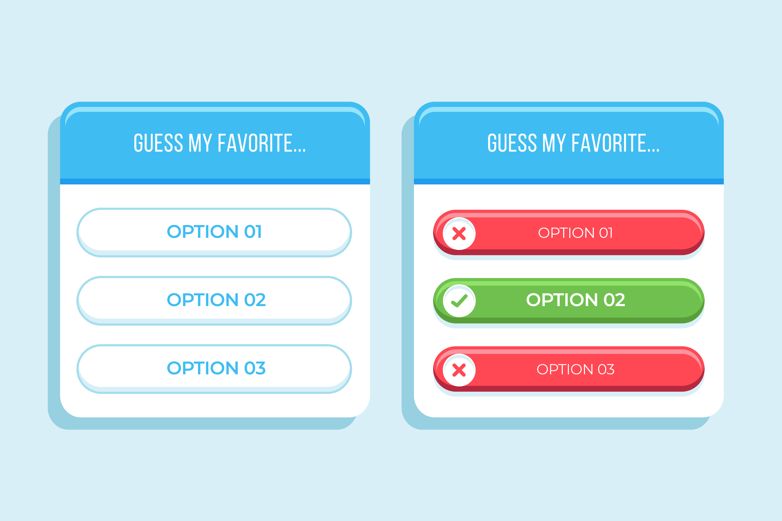
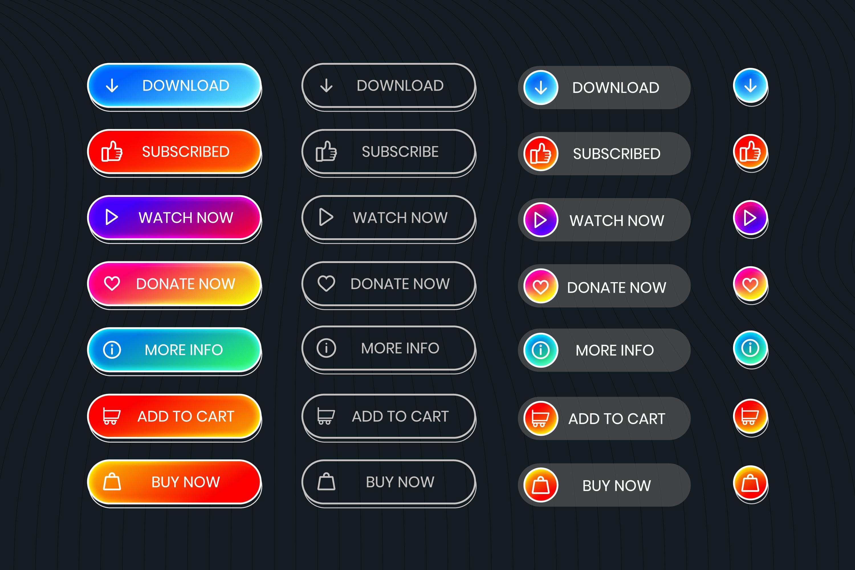
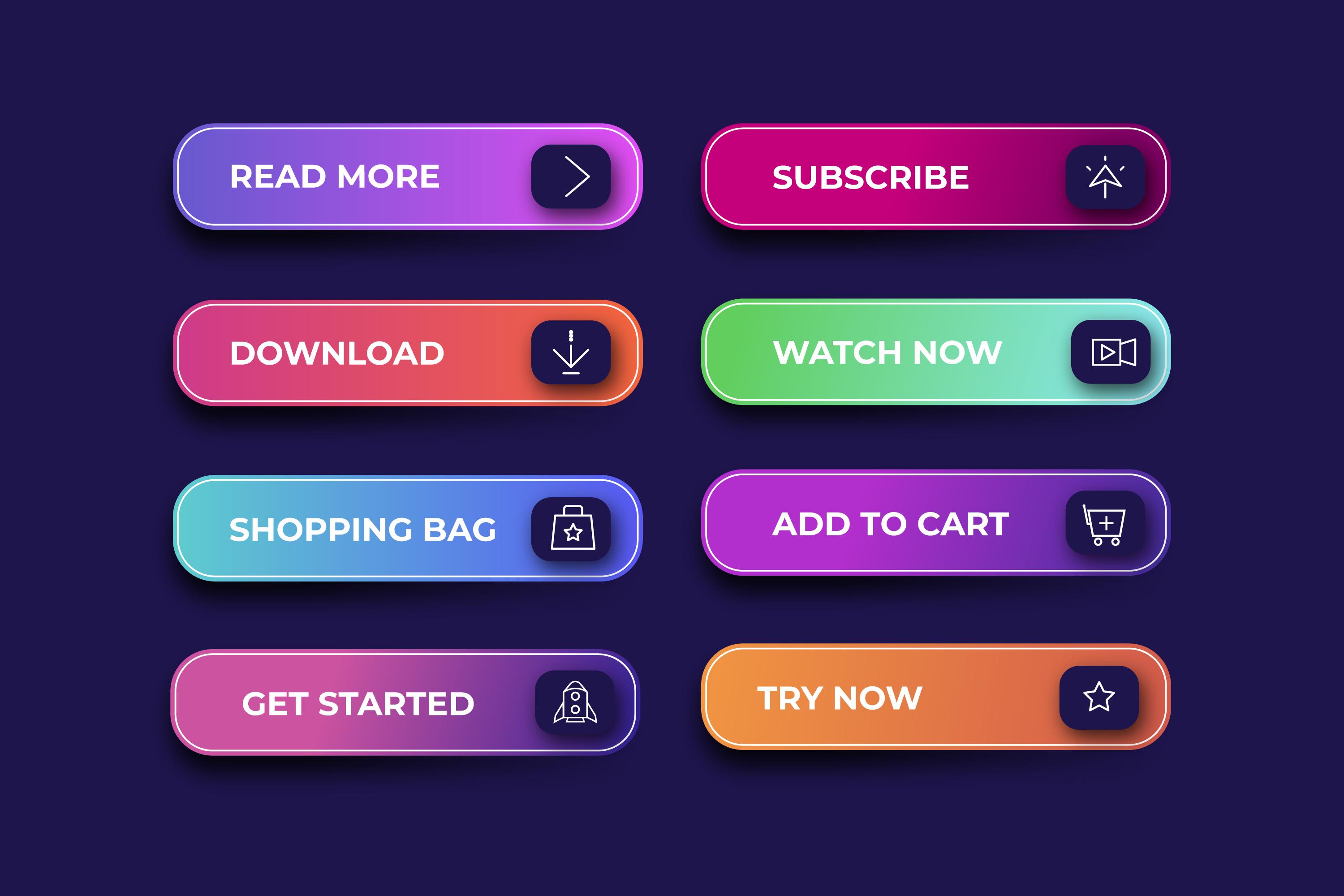
In user interface design, a button serves as a way for users to take action. A call to action (CTA) in UI guides users toward a goal, like signing up or buying something. A good CTA button design makes what happens when you click clear. It needs to stand out and be easy to find. A simple, clear message like "Subscribe Now" can work wonders.
When designing website buttons, color and size matter. Make sure it’s big enough to notice but not too big to feel overwhelming. Choose a color that pops but still fits the overall look. A good button makes users feel confident to click and move forward.
Why CTA Buttons Matter for Getting Users to Take Action
When people land on your website, you want them to do something—whether it's signing up, buying something, or getting in touch. CTA buttons are what help make that happen. They act as clear directions, telling users exactly what to do next. Without them, people might visit your site and leave without taking any action. A well-designed CTA button makes it super easy for users to understand what will happen if they click on the button. For example, a button that says “Join Now” or “Get Started” shows them exactly what they’re getting into. The clearer the message, the more likely they’ll be to follow through.
The design of your website buttons matters, too. A button that’s too small or blends in with the background can be easily missed. But if the button is the right size and stands out, people will notice it and be more likely to click. The text you use is key as well. Simple phrases like “Sign Up Today” or “Learn More” create a sense of urgency and make it obvious what users will get when they click.
At the end of the day, CTA web design is all about making things simple and easy for your visitors. When your buttons are clear, visible, and inviting, you’ll help guide users to take action—and that can lead to more sign-ups, purchases, or whatever you want them to do.

How to Design a Button That Stands Out and Drives Action
Creating a button on your website that grabs attention and encourages visitors to take action is no small task. Website button styles play a big role in whether or not users decide to click. When designing homepage buttons, the goal is to make them noticeable, clear, and inviting. But there are a few key things to keep in mind that will help you create website buttons that people will want to click. Here’s how to design a button that works.
Choose the Right Colors for Your CTA Button
Colors have a powerful effect on human emotions and can influence decisions. To make your button stand out, choose colors that contrast with the rest of the page. For example, if your website has a lot of cool blues or neutrals, a bright, bold color like orange or green will really grab attention.
However, color isn’t just about contrast. It’s also about emotion. Red can create a sense of urgency, which makes it great for time-sensitive calls to action. Green is often associated with positive actions like “Go” or “Success.” Blue gives a sense of trust, while yellow grabs attention without being overwhelming. Think about your audience and what action you want them to take before choosing a color. The right color can encourage users to click buttons without thinking twice.
Be Mindful of the Shape and Size of Your CTA Button
A button that is too small can get lost on the page and won’t catch the user’s eye. But a button that’s too big might feel out of place or even annoy users. Finding the right button size for a website is all about balance. It should be large enough to stand out but not so large that it overwhelms the design.
Shape is important, too. Round corners often feel softer and more inviting, while sharp corners may come across as more formal. Buttons with rounded edges tend to work well for most websites because they appear more approachable. Make sure the button is big enough for people to easily tap or click, especially on mobile devices where touch interaction is key.
The Placement of Your Call to Action Button Is Critical
If the button is buried at the bottom of the page or hidden in a cluttered section, users may not even see it. For the best results, place your CTA button where it’s easy for users to find. In general, placing it above the fold so users can see it without scrolling is ideal.
When thinking about the placement of your call to action button, don’t forget to consider mobile users. Many websites now get more traffic from mobile devices than desktops, so your button needs to be easy to see and click on smaller screens as well. Test your placement to make sure your buttons are visible and accessible across all devices.

Add Compelling Copy to Your CTA Button
The text on your button is just as important as the design. You want to give users a clear idea of what they’re going to get when they click buttons. Avoid vague language. Instead of “Click Here,” use something more specific like “Get Your Free Trial” or “Start Your Journey.” People are more likely to act when they know exactly what will happen next.
Also, make sure your button copy matches the promise on the page. For instance, if you’re offering a discount, your button could say “Get 20% Off Today” or “Claim Your Offer.” This builds trust and reduces any confusion about what the user will get.
Appeal to Your Audience's Emotions with Your CTA Button
Emotions drive decisions. People don’t just click buttons because they’re instructed to—they click because they feel compelled to take action. To get users to act, think about what emotions you want to trigger with your CTA. Do you want them to feel excited? Curious? Safe? Different emotions work for different types of actions.
For example, if you’re encouraging users to subscribe to a newsletter, you might want to use words that make them feel curious or intrigued. A button that says “Get Insider Tips” or “Discover New Trends” sparks interest. On the other hand, if you’re selling a product or service, use language that creates urgency or excitement, like “Shop Now” or “Don’t Miss Out.”
Button Ideas for Website: Make It Stand Out
Designing cool website buttons that people want to click on is about more than just the look—it’s about making the button part of the user experience. One idea is to add a hover effect, where the button changes color or has a subtle animation when users hover their mouse over it. This gives the button a more interactive feel, making it more inviting to click. You can also experiment with different textures or shadows to make the button look clickable and ready to be pressed.
It’s also important to think about the type of action you want users to take. If you’re asking them to sign up for something, make your button inviting and friendly, with words like “Join Us” or “Start Your Free Trial.” If the action is more urgent, like buying something, use stronger, more direct language like “Buy Now” or “Shop Today.”

Working with a Button Designer
If you're not a designer or you're looking to take your website’s buttons to the next level, consider working with a button designer who specializes in creating effective, attention-grabbing buttons. A professional designer can help you come up with creative button ideas for websites that fit both your branding and your goals. They can also make sure that the design of the button works well with the rest of your website, making it a natural yet eye-catching part of your page.
In the end, designing buttons is about making sure your users know exactly what action to take and feel excited to do so. With the right colors, size, placement, copy, and emotional appeal, your buttons will not only get noticed—they’ll get clicked. So take the time to test, tweak, and optimize your CTA buttons, and you’ll see a difference in how many visitors follow through with the actions you want them to take.
Contents
1. Why CTA Buttons Matter for Getting Users to Take Action
2. How to Design a Button That Stands Out and Drives Action
3. Choose the Right Colors for Your CTA Button
4. Be Mindful of the Shape and Size of Your CTA Button
5. The Placement of Your Call to Action Button Is Critical
6. Add Compelling Copy to Your CTA Button
7. Appeal to Your Audience's Emotions with Your CTA Button
8. Button Ideas for Website: Make It Stand Out
9. Working with a Button Designer
Back to the top
The answers to your questions
What is a CTA in web design?
A CTA, or call-to-action, is an element on a website that prompts users to take a specific action. It’s usually a button with text like “Sign Up,” “Buy Now,” or “Learn More.” CTAs are designed to guide visitors toward completing a goal, such as making a purchase, subscribing, or learning about a service.
How to make a button go to another page?
Most website builders and platforms make it easy to link buttons to other pages. When creating or editing a button, you’ll usually see an option to add a link. Simply enter the URL or select the page from your site’s menu, and the button will take users there when clicked. If you're using a CMS like WordPress or Wix, the process is straightforward, with drag-and-drop interfaces and linking options.
What color button gets the most clicks?
Colors like red, orange, and green often perform well for buttons because they stand out and grab attention. However, the best color for your button depends on your website’s design. Choose a color that contrasts with the background and fits your brand while still catching the user’s eye.
What is a button on a website?
A button on a website is an interactive element that users click to perform an action, such as submitting a form, navigating to another page, or completing a purchase. Buttons are often styled with bold text, shapes, and colors to make them noticeable and encourage interaction.
