

A great tech website design is more than just looking good. It's about creating a smooth experience for users. Visitors should find what they're looking for quickly and easily. When a website is designed well, it builds trust and keeps people coming back. Clear, simple layouts and easy-to-read text are key. Good design helps visitors understand the product or service without feeling overwhelmed. It also reflects the company's professionalism. With so many technological web designs out there, having a well-organized and attractive design makes a big difference in standing out and keeping users engaged.

Top Tech Websites with Exceptional Designs
There are countless tech websites with amazing designs, each standing out for its unique approach. These websites follow some key web design processes that make them both visually appealing and easy to use. From clear navigation to smart use of colors and typography, they all focus on creating a positive user experience.
Wanted For Nothing

URL: Wanted For Nothing
The "Wanted For Nothing" website shows a minimalist design that emphasizes simplicity and clarity. It’s clear from the first glance that the modern tech website design avoids clutter, focusing on what really matters: communication. The use of white space is especially striking, allowing each section to breathe and making the content easy to digest. This approach keeps visitors from feeling overwhelmed, which is often a problem with many other sites.
One of the standout features of the design is the use of clean typography. The text is well-spaced and readable, ensuring that visitors can quickly absorb the information. The interactive elements of the site also add a dynamic feel, without being too intrusive. For example, the buttons and links provide gentle hover effects. You can see them offering visual feedback when the user interacts with them. This small detail adds to the overall feel of the site, making it more engaging without distracting from the content.
From a user experience standpoint, the site flows naturally. Each section is designed to guide the visitor through the services the agency provides, creating a smooth path for those who are interested in learning more. The overall approach makes the website highly accessible, both visually and functionally, and this is a hallmark of good design. It shows how simplicity can be powerful when executed well.
Roger Junior Portfolio

The "Roger Junior Portfolio" site takes a more visual approach, with a tech company website design that places a heavy emphasis on imagery. The site uses a grid layout to showcase Roger’s work, which is ideal for a portfolio site. The grid system allows each project to stand out on its own while maintaining a sense of balance and harmony across the page.
The high-resolution images used are a key aspect of the site’s design. They are clear and sharp, allowing visitors to appreciate the details of each project. The subtle hover effects provide an interactive element, allowing the user to get more details or experience the project in a new way. These effects are smooth, thus adding a touch of elegance and modernity to the site.
The use of minimal text is a strong choice for this portfolio site. The visuals are the main focus, and the lack of excessive content allows the projects to take center stage. Visitors don’t need to sift through long paragraphs of text to understand what Roger has done. The brief descriptions provided are enough to give context without overwhelming the user.
What’s also noteworthy is how well the site adapts across devices. This responsive top technology website ensures that whether you're on a desktop, tablet, or phone, the website looks good and functions well. The layout adjusts to the screen size, providing an optimal viewing experience on any device.
Buzzworthy Studio

URL: Buzzworthy Studio
Buzzworthy Studio’s website is an excellent example of how creative website design for a technology company can enhance user engagement. One of the first things that stands out about the site is its innovative menu. Unlike traditional top navigation, the menu here is dynamic and offers a more interactive approach to discovering content. This can be a fun and engaging way to explore the different sections of the site, making it more memorable for users.
Smooth animations and transitions are another standout feature of the design. When users scroll or hover over elements, they encounter subtle animations that create a sense of motion without being distracting. These animations contribute to the modern and fresh feeling of the website, giving it a polished, high-end look.
The content is well-organized, which makes it easy for visitors to understand what the studio offers. The design guides users through the site without overwhelming them. For example, the sections are clearly defined and spaced out. This makes it easy to jump from one area to the next. This logical flow ensures that users can find the information they need quickly.
Jeton
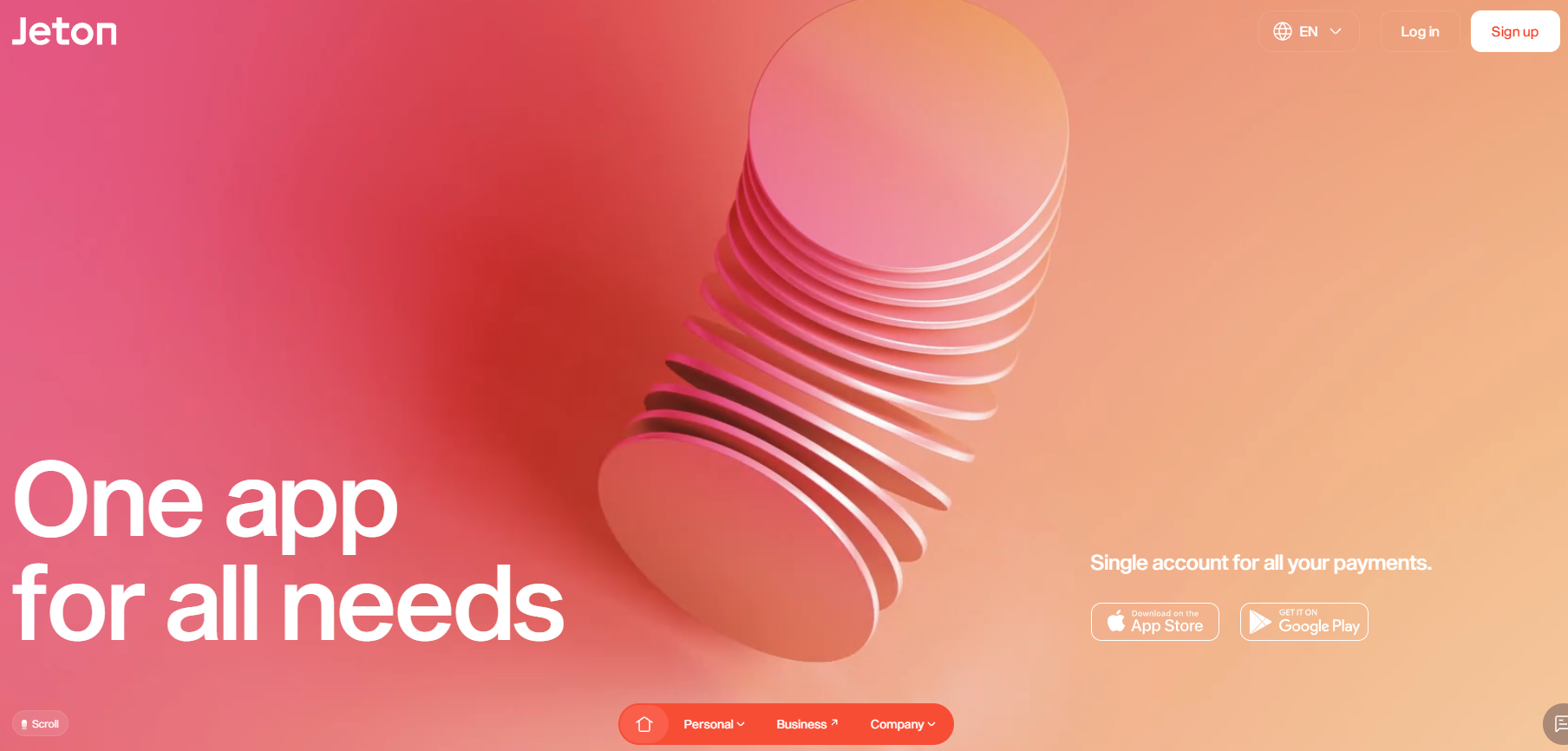
URL: Jeton
Jeton’s website is a perfect example of good website design in the financial services sector. The site is clean, with a well-organized layout that guides visitors through its services with ease. From a design perspective, the use of vibrant colors is effective in drawing attention to key areas of the website. Bright accents are strategically placed to highlight calls to action, making it clear what the next steps are for users who want to learn more or sign up.
The intuitive navigation is another strong feature of the tech company website design. Each page flows smoothly into the next, and users can quickly access important information like pricing, features, and customer support. This simplicity in the layout and structure helps users feel comfortable and confident in what they’re reading.
The dynamic pictures, such as high-quality images and clean icons, are amazing without being overly complex. They complement the content, helping to illustrate the services Jeton offers without overwhelming the visitor. These elements keep the site looking fresh and modern while still maintaining a professional tone.
David Langarica

URL: David Langarica
David Langarica’s portfolio website is a great example of how a personal site can effectively highlight the designer’s skills and personality. The site has a clean website design for a technology company with engaging animations that add a creative touch without being overwhelming. These animations are not just decorative but serve to enhance the user’s experience, offering something visually appealing while maintaining the site’s clarity.
One thing that stands out is the responsiveness of the design. The layout adjusts perfectly across different devices, ensuring that the site is easy to use on both desktop and mobile. This is crucial, especially for a designer whose potential clients may be accessing the site from various devices.
From a user experience perspective, the site is intuitive and easy to use. The navigation is straightforward, and the content is well-organized. The minimal use of text allows the work to speak for itself, while the subtle animations and smooth transitions make the experience more interactive.
Formless
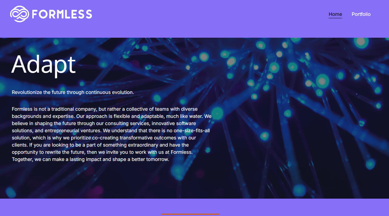
URL: Formless
The "Formless" website stands out as a clean and modern technology website example. Its focus is on simplicity and functionality, which is ideal for creating a professional online presence. The monochromatic color scheme is striking, using a variety of shades to create depth without cluttering the visual space. This approach not only keeps the design minimal but also ensures the content remains the focal point.
One of the great design features here is the use of interactive elements. They’re subtle but add a layer of sophistication. These elements keep the site feeling dynamic and engaging. For example, buttons react to hover actions, providing a slight animation that feels fresh without being distracting.
From a user experience point of view, the website is very easy to use. The layout is intuitive, and visitors can easily find what they’re looking for. The focus on functionality makes the browsing experience simple and smooth, which is what users want when they visit a website. A good website design serves the content perfectly, making it easy for visitors to engage without distractions.
Apple
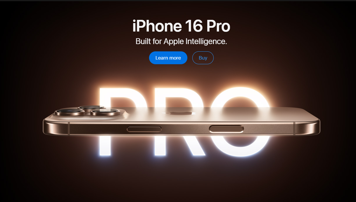
URL: Apple
Apple’s website is a benchmark in web design, and it sets the bar for many others. The clean, minimalist design is instantly recognizable and mirrors the company’s brand values. The use of high-quality product images on the homepage is effective—each product takes center stage, showing off its design and features in the best light.
The layout is simple, with plenty of white space that allows the images and copy to breathe. This makes it easier for users to focus on what matters most: the products. The clear navigation structure adds to the ease of use. It’s simple, with each section leading visitors to what they need without confusion. Interactive elements like product sliders and quick-view features bring the site to life. These elements make it easy for visitors to explore different product options without leaving the page.
Overall, Apple’s website stands out not just because of its clean look but because it’s designed to keep visitors engaged while maintaining a simple, intuitive experience. Every element on the page feels deliberate and supports the user’s journey through the site.
Kassow Robots
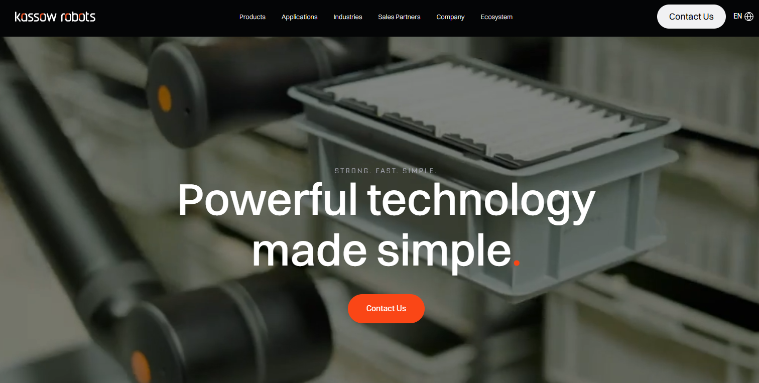
URL: Kassow Robots
Kassow Robots' website does a great job of reflecting the cutting-edge nature of its robotics products. The design is sleek and modern, with high-quality images and videos that show the robots in action. This visual approach is effective in giving visitors a clear understanding of what the robots can do and how they can be used in real-world settings.
The website is well-structured, and the content is broken into easy-to-digest sections. Navigation is simple, with a clear path to information about the robots, their capabilities, and how they can be integrated into various industries. The color scheme is consistent throughout the site, with a professional tone that mirrors the advanced nature of the products.
What stands out is how the design supports the product. Instead of overwhelming visitors with too much text or complex technical jargon, the website relies on visuals to tell the story. This is important for a robotics company, as visuals are often the best way to convey complex ideas. The use of videos and images makes the site interactive and engaging, providing a more dynamic browsing experience.
Elementus
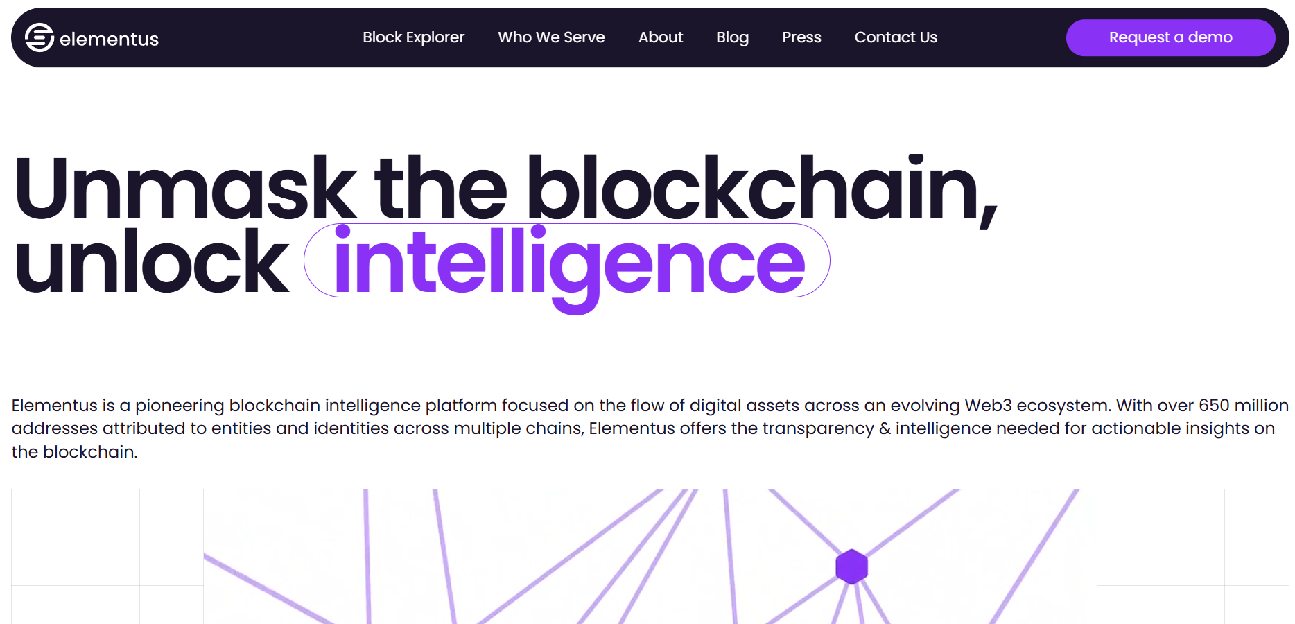
URL: Elementus
Elementus' website is a great example of clean, professional design, especially for a blockchain analytics platform. It uses a well-thought-out layout with simple yet effective data visualizations and infographics. These visual elements break down complex information, making it much easier for users to understand. The goal here is to make sophisticated data more accessible, and the design achieves this in a user-friendly way.
The consistent color palette ties the design together, maintaining a cohesive look across the entire site. The typography is clear and readable, helping users focus on the content without feeling strained. The design doesn’t overwhelm users with too much information at once; instead, it presents data in manageable chunks, allowing visitors to absorb the material at their own pace. Another key design feature is the responsiveness of the site. Whether users are accessing it from a desktop, tablet, or mobile device, the layout adapts beautifully to each screen size.
From a user experience standpoint, the site is easy to understand and engage with. The design uses simple navigation and clear calls to action, which help visitors quickly find what they’re looking for. This level of ease and clarity makes the site a great tool for educating visitors about blockchain analytics.
Pison
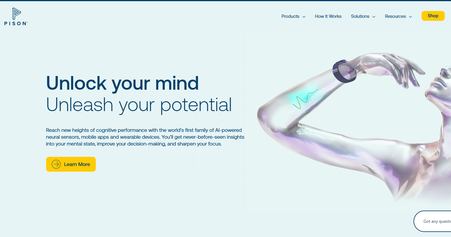
URL: Pison
Pison’s website uses a sleek, modern design that’s visually appealing and functional. The dark color scheme gives it a more futuristic feel, while the bright accents draw attention to important elements, such as calls to action or key features of their product. This contrast creates a visually interesting layout that guides users to the most important content on the page.
The use of high-quality visuals and videos is a key strength of the design. These elements help users understand the product’s capabilities by showing it in action. Instead of just reading about the technology, visitors get to see it working in real-time, which adds a layer of engagement and interaction.
The website layout is also well thought out. The sections are organized logically, making it easy for users to follow the flow of information. Navigation is simple and intuitive, with clear labels and a straightforward structure that makes it easy for visitors to find what they need.
Pison’s website also stands out for its smooth user experience. The design is responsive, adjusting to different devices without losing its functionality or aesthetic appeal. This responsiveness ensures that the site works well on all screens, whether someone is using a phone, tablet, or desktop.
Genvid Technologies

URL: Genvid Technologies
Genvid’s website is a great example of modern design that puts its products at the forefront. The site’s design does a fantastic job of showcasing their interactive streaming solutions through high-quality images and videos. These visuals help potential customers understand the technology behind their services, offering them a direct insight into what Genvid offers.
The use of a consistent color scheme and clean typography creates a strong visual identity. The design feels polished and professional without overwhelming the visitor. This consistency in colors and fonts makes the content easy to follow and the overall look pleasant.
Navigation is smooth and intuitive, meaning visitors can explore different sections of the website with minimal effort. Whether users want to learn about products, view case studies, or check out resources, the site layout makes it easy to get where they want to go. The navigation elements are clear, and there’s no confusion about where to find relevant information.
From a user perspective, this site offers a fluid and comfortable experience. The balance of text and visuals makes it engaging without distracting from the main message. The design achieves its goal of providing an informative, easy-to-understand, and visually appealing user experience.
Hautech AI
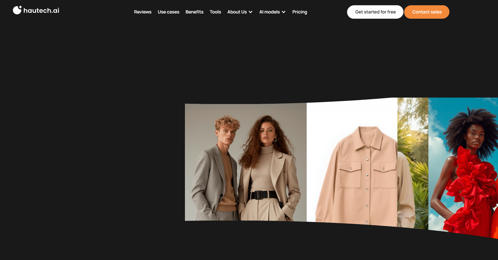
URL: Hautech AI
Hautech AI’s website stands out with a modern tech website design that reflects the company’s focus on artificial intelligence. The homepage is eye-catching right from the start, with dynamic animations and interactive elements that immediately grab the visitor’s attention. These interactive features give users a sense of the company’s innovative approach and help bring their AI solutions to life in an engaging way.
The color scheme is striking, with dark tones highlighted by vibrant neon accents. This combination of colors creates a bold contrast that makes important information stand out. The layout is simple, and the navigation is intuitive. This makes it easy for visitors to explore the company’s offerings without feeling lost or overwhelmed.
From a design perspective, this website is a perfect representation of Hautech AI’s focus on cutting-edge technology. It feels fresh, modern, and futuristic, while still being highly user-friendly. The interactive elements and striking visuals not only make the site visually interesting but also help visitors connect with the brand’s innovative spirit.
Adurant Labs
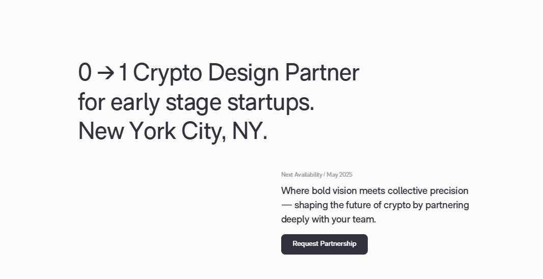
URL: Adurant Labs
Adurant Labs’ website takes a minimalist approach, focusing on clarity and ease of use. The homepage immediately communicates the company’s value proposition in a concise and straightforward manner. This is important, as it lets visitors quickly understand what the company offers and why it matters, without having to search for answers.
The design is simple, with minimal graphics and a clean layout that avoids any unnecessary clutter. The use of white space helps keep the site feeling open and accessible, making it easy for users to focus on the important information. One of the standout features of the design is the use of a monochromatic color palette with occasional accent colors. This adds depth to the site, highlighting key areas without making the design too busy. The navigation is very straightforward. The layout is structured to make it easy for users to find what they’re looking for, with simple links that lead to more detailed pages.
For users, the experience on Adurant Labs’ website is clean, easy to follow, and efficient. The minimalist design is effective in keeping the content focused and accessible. The clear structure of the site ensures that visitors can find the information they need quickly, making it a good example of a website designed with the user in mind.
The Verge
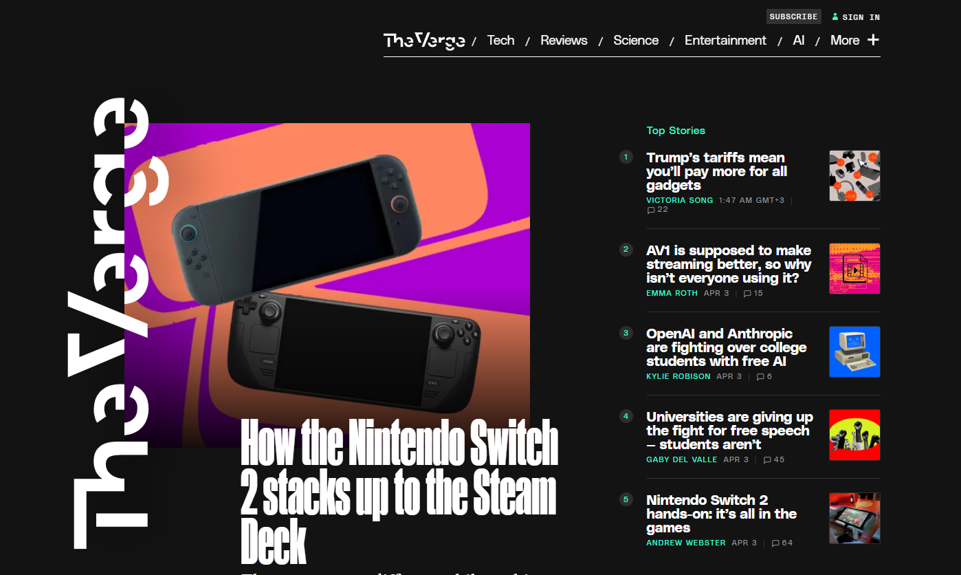
URL: The Verge
The Verge’s website embraces a bold and dynamic design that reflects its role as a technology news platform. The use of vibrant colors and large imagery creates an engaging visual experience that draws visitors in. The images on the homepage are striking and help convey the exciting nature of the tech news The Verge covers.
The modular grid layout is another key feature of the site. This layout allows the content to be organized into neat sections, making it easy to browse through a variety of stories and articles. Each section stands out on its own, with ample space between them, which helps prevent the site from feeling too cluttered. Navigation on The Verge is intuitive and simple. The main topics are clearly labeled, allowing visitors to jump from one section to another without difficulty. The site makes it easy for users to access a wide range of content, from news to reviews to videos.
Skazy AI
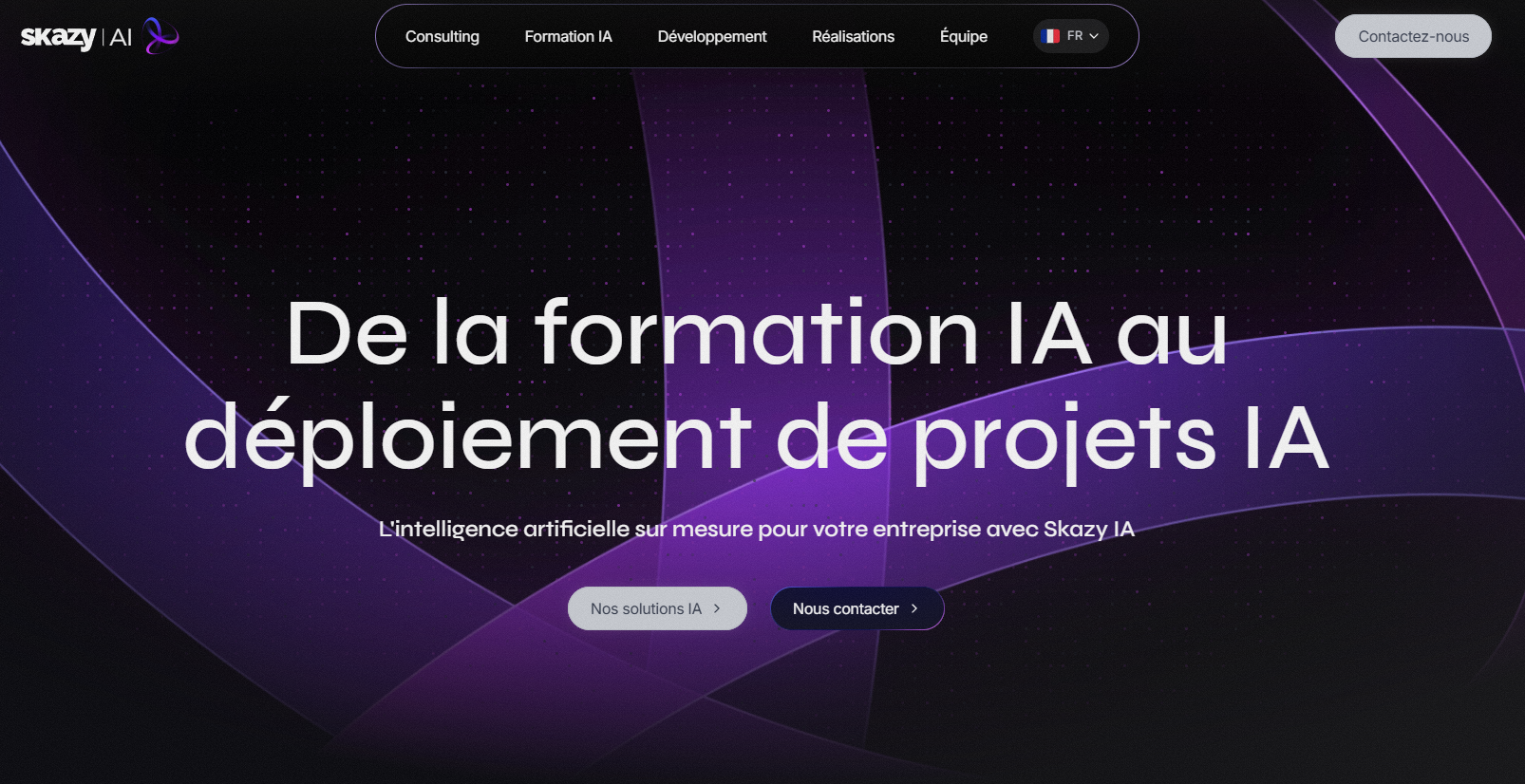
URL: Skazy AI
Skazy AI’s website is another great example of a company in the artificial intelligence space using design to reflect its brand. The website uses futuristic visuals and sleek animations to showcase the company’s AI technology. These interactive elements help users engage with the content while offering a more immersive browsing experience.
The color scheme is modern, with a mix of dark tones and bright highlights that draw attention to key information. The contrast between the dark background and neon accents gives the site a high-tech, futuristic feel, which matches the company’s focus on cutting-edge AI solutions.
The modern tech website design is clean and organized. The homepage provides clear sections, each offering a glimpse into Skazy AI’s services, products, and innovations. The navigation is easy to use, with simple menus that allow visitors to find relevant content without hassle. The interactive features of the site make it feel more alive. These elements bring the content to life and help users feel connected to the company’s innovative work.
For businesses in any industry, these websites provide great examples of how design can not only look good but also support user engagement, making it easier for visitors to understand the company’s offerings and take action. Outsource web design to get amazing results like these websites have. Each site proves that good design is about more than just visuals—it’s about creating an experience that makes it easy for users to engage, learn, and connect with the brand.
